Otter IOS End-to-end
Otter IOS End-to-end
Otter IOS End-to-end
Project Overview
Role
UI/UX Designer
Team
Individual project mentored by Carolina de Bartolo
Timeline
8 weeks, August 2024-October 2024
Tools Used
Figma, Figjam, Canva, Procreate, Google Meets, Design Thinking, Agile Methodology
Note
Otter is an original concept of mine and designed fully as an IOS native app
The Context
Problem
There’s a growing loneliness epidemic in the United States, with its effects being as dangerous as smoking 15 cigarettes a day. Young adults often struggle to balance self-care with the social interactions they crave.
Solution
To address this, I wanted to design a platform that offers an intuitive and easy way for users to connect with new people. Enter Otter!
What is Otter?
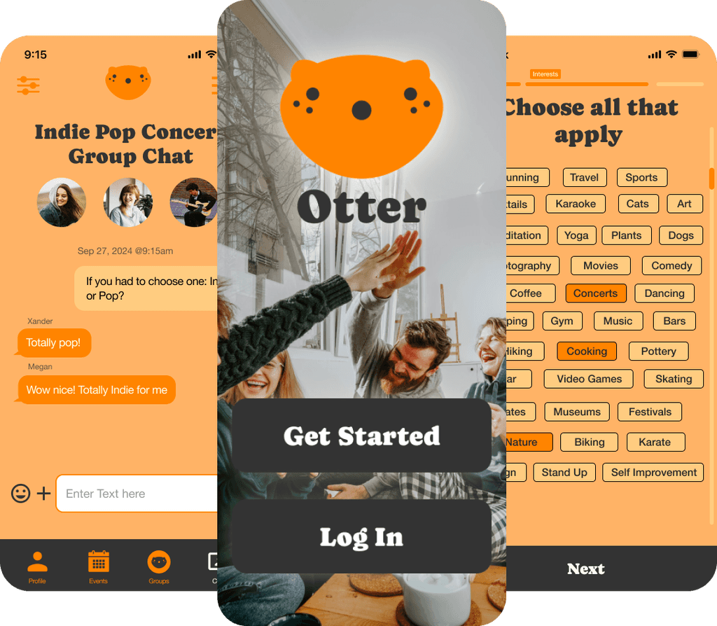
Otter is a pressure-free platform for meeting new people and forming meaningful connections. With Otter, you can connect with others based on shared interests in a group setting. Whether you're passionate about hiking, gaming, art, or any other hobby, Otter makes it easy to join groups that match your interests. From there, you can discover local events and activities, making it simple to bond with like-minded individuals in a relaxed environment.
Project Goal
I want to understand who is craving social connection and what barriers are preventing them from finding it, so we can bring these people together through shared hobbies and interests.
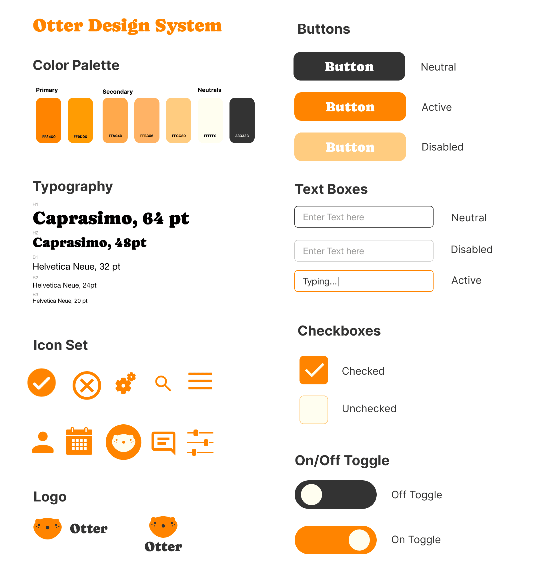
Otter UI Style Kit
Otter UI Style Kit
Defining User Needs
User Interviews
I interviewed 6 people who expressed interest in expanding their social life. We gathered their priorities and found areas where we could address common needs.
User Interview Results
Challenges in forming new relationships
Desire for more social activity
Openness to meeting new people
Openness to technology for social connections
Interest in engaging in hobbies with others
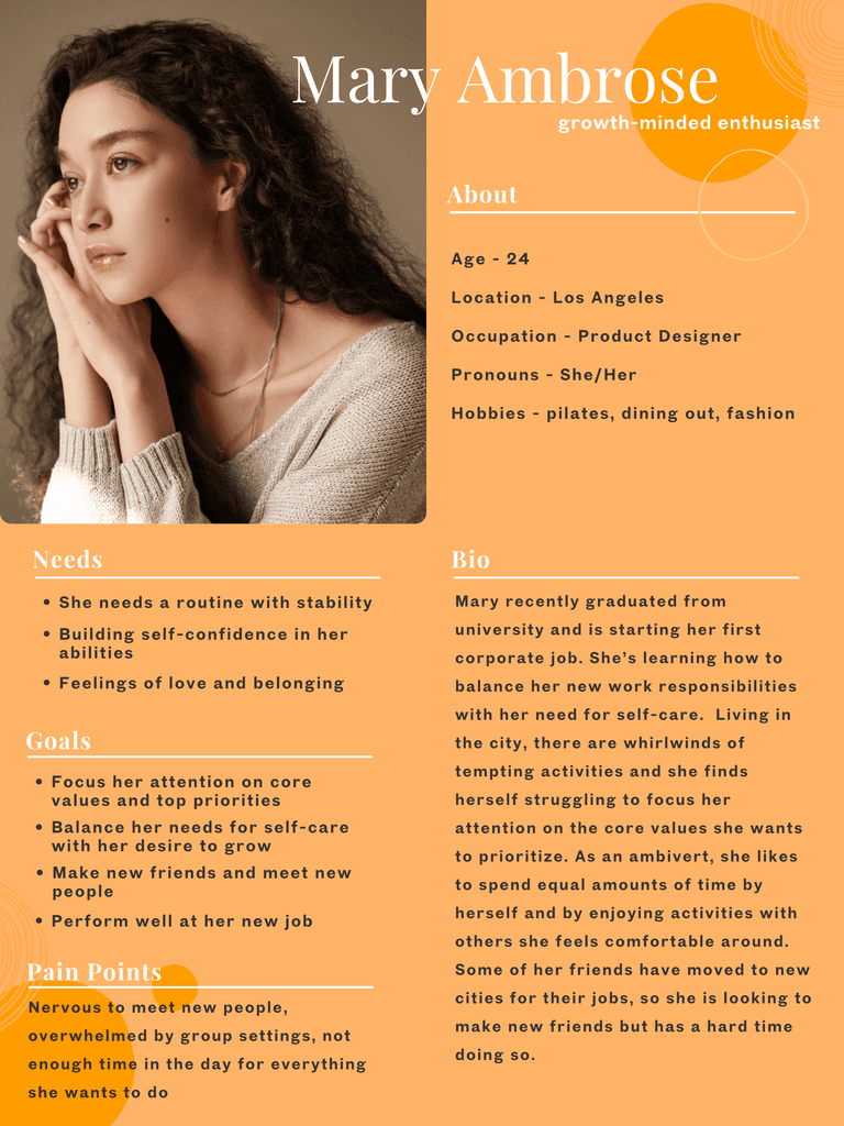
Otter User Persona
Otter User Persona

Otter Point of View's and How Might We's
Otter Point of View's and How Might We's

Otter User Task Flow
Otter User Task Flow

Otter Mid-Fi Wireframes
Otter Mid-Fi Wireframes

Otter Lo-fi Sketches vs Hi-Fi Wireframes
Otter Lo-fi Sketches vs Hi-Fi Wireframes

Otter Hi-Fi Wireframe Screenshots
Otter Hi-Fi Wireframe Screenshots

User Feedback
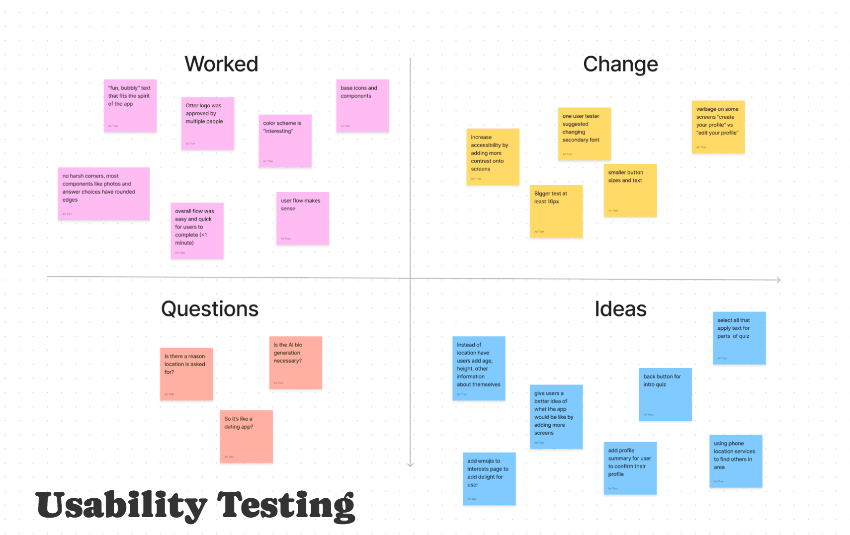
Usability Testing
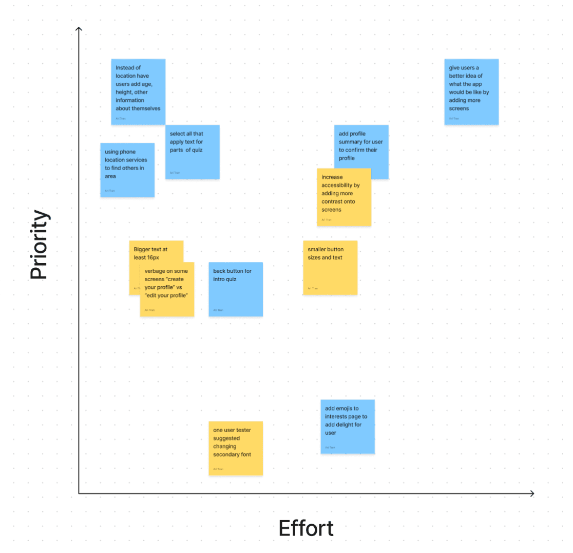
I asked users what they thought of the original prototype and compiled their notes into two graphs. Graph 1 splits up their comments into what works, what questions people had, recommended changes and ideas. Graph 2 lays out their recommended changes into the level of priority and amount of effort it would take me to change the design.
Revising and Iterating
Based off direct user feedback, this is what I changed:
more contrast for accessibility
adding strokes to boxes
back button in top left corner
changing "edit your profile" to "create your profile"
more depth in initial screen
smaller "next" buttons
bigger text fields
user profile summary at end
use phone location services instead of having user input street address
height, age options
Key Takeaways
Reflection
Looking back, designing Otter has been equally challenging and rewarding. I spent weeks incorporating the design process I learned in bootcamp and having a prototype to show for it at the end of the day feels incredibly gratifying.
Future Notes
Some notes for future design is asking for user feedback early and often. There are moments where I could have saved myself some time and trouble if I had communicated more directly with users to see what they really needed vs what I think they wanted.
Having completed my first fully native IOS app, I anticipate future designs going increasingly smoother!
Otter Prototype
Otter Prototype
Project Overview
Role
UI/UX Designer
Team
Individual project mentored by Carolina de Bartolo
Timeline
8 weeks, August 2024-October 2024
Tools Used
Figma, Figjam, Canva, Procreate, Google Meets, Design Thinking, Agile Methodology
Note
Otter is an original concept of mine and designed fully as an IOS native app
Defining User Needs
User Interviews
I interviewed 6 people who expressed interest in expanding their social life. We gathered their priorities and found areas where we could address common needs.
User Interview Results
Challenges in forming new relationships
Desire for more social activity
Openness to meeting new people
Openness to technology for social connections
Interest in engaging in hobbies with others


The Context
Problem
There’s a growing loneliness epidemic in the United States, with its effects being as dangerous as smoking 15 cigarettes a day. Young adults often struggle to balance self-care with the social interactions they crave.
Solution
To address this, I wanted to design a platform that offers an intuitive and easy way for users to connect with new people. Enter Otter!
What is Otter?
Otter is a pressure-free platform for meeting new people and forming meaningful connections. With Otter, you can connect with others based on shared interests in a group setting. Whether you're passionate about hiking, gaming, art, or any other hobby, Otter makes it easy to join groups that match your interests. From there, you can discover local events and activities, making it simple to bond with like-minded individuals in a relaxed environment.
Project Goal
I want to understand who is craving social connection and what barriers are preventing them from finding it, so we can bring these people together through shared hobbies and interests.
User Feedback
Usability Testing
I asked users what they thought of the original prototype and compiled their notes into two graphs. Graph 1 splits up their comments into what works, what questions people had, recommended changes and ideas. Graph 2 lays out their recommended changes into the level of priority and amount of effort it would take me to change the design.
Revising and iterating
Based off direct user feedback, this is what I changed:
more contrast for accessibility
adding strokes to boxes
back button in top left corner
changing "edit your profile" to "create your profile"
more depth in initial screen
smaller "next" buttons
bigger text fields
user profile summary at end
use phone location services instead of having user input street address
height, age options
Key Takeaways
Reflection
Looking back, designing Otter has been equally challenging and rewarding. I spent weeks incorporating the design process I learned in bootcamp and having a prototype to show for it at the end of the day feels incredibly gratifying.
Future Notes
Some notes for future design is asking for user feedback early and often. There are moments where I could have saved myself some time and trouble if I had communicated more directly with users to see what they really needed vs what I think they wanted.
Having completed my first fully native IOS app, I anticipate future designs going increasingly smoother!
Project Overview
Role
UI/UX Designer
Team
Individual project mentored by Carolina de Bartolo
Timeline
8 weeks, August 2024-October 2024
Tools Used
Figma, Figjam, Canva, Procreate, Google Meets, Design Thinking, Agile Methodology
Note
Otter is an original concept of mine and designed fully as an IOS native app


The Context
Problem
There’s a growing loneliness epidemic in the United States, with its effects being as dangerous as smoking 15 cigarettes a day. Young adults often struggle to balance self-care with the social interactions they crave.
Solution
To address this, I wanted to design a platform that offers an intuitive and easy way for users to connect with new people. Enter Otter!
What is Otter?
Otter is a pressure-free platform for meeting new people and forming meaningful connections. With Otter, you can connect with others based on shared interests in a group setting. Whether you're passionate about hiking, gaming, art, or any other hobby, Otter makes it easy to join groups that match your interests. From there, you can discover local events and activities, making it simple to bond with like-minded individuals in a relaxed environment.
Project Goal
I want to understand who is craving social connection and what barriers are preventing them from finding it, so we can bring these people together through shared hobbies and interests.
The User
User Interviews
I interviewed 6 people who expressed interest in expanding their social life. We gathered their priorities and found areas where we could address common needs.
User Interview Results
Interest in hobbies
Challenges in forming new relationships
Desire for more social time
Openness to meeting new people
Use of technology for social connections
Potential for a platform to facilitate connections
Group vs one-on-one settings
User Feedback
Usability Testing
I asked users what they thought of the original prototype and compiled their notes into two graphs. Graph 1 splits up their comments into what works, what questions people had, recommended changes and ideas. Graph 2 lays out their recommended changes into the level of priority and amount of effort it would take me to change the design.
Revising and Iterating
Based off direct user feedback, this is what I changed:
more contrast for accessibility
adding strokes to boxes
back button in top left corner
changing "edit your profile" to "create your profile"
more depth in initial screen
smaller "next" buttons
bigger text fields
user profile summary at end
use phone location services instead of having user input street address
height, age options
Key Takeaways
Reflection
Looking back, designing Otter has been equally challenging and rewarding. I spent weeks incorporating the design process I learned in bootcamp and having a prototype to show for it at the end of the day feels incredibly gratifying.
Future Notes
Some notes for future design is asking for user feedback early and often. There are moments where I could have saved myself some time and trouble if I had communicated more directly with users to see what they really needed vs what I think they wanted.
Having completed my first fully native IOS app, I anticipate future designs going increasingly smoother!



Defining User Needs
User Interviews
I interviewed 6 people who expressed interest in expanding their social life. We gathered their priorities and found areas where we could address common needs.
User Interview Results
Desire for more social activity
Challenges in forming new relationships
Openness to meeting new people
Openness to technology for social connections
Interest in engaging in hobbies with others
The User
User Interviews
I interviewed 6 people who expressed interest in expanding their social life. We gathered their priorities and found areas where we could address common needs.
User Interview Results
Interest in hobbies
Challenges in forming new relationships
Desire for more social time
Openness to meeting new people
Use of technology for social connections
Potential for a platform to facilitate connections
Group vs one-on-one settings
