Wayfarer Case Study
Wayfarer Case Study
Wayfarer Case Study
Project Overview
Role
UI/UX Designer
Team
Individual project mentored by Bob Ricca and Diana Martinez
Timeline
8 weeks; May 2024-July 2024
Tools Used
Figma, Adobe Firefly, Google Meets, Google Fonts
Note
My first ever UI/UX design project, with a multi-step form and breakpoints created for mobile, tablet, and desktop. Wayfarer is a design brief provided by Designlab, and us students were tasked to create an original design.
The Context
Problem
Aspiring travelers need help with travel inspiration specific to their tastes and are having trouble finding the customization they're craving.
Solution
Providing travelers with a way to input what kind of trip they're looking for so they can get the results they care most about.
What is Wayfarer?
Enter Wayfarer, a website that helps you book travel and activities with recommendations based off precisely what you're looking for. Customize your travel experience by finding a destination specific to your needs, complete with excursions and options for local experiences. You can search by the most popular destinations, or take a quiz to get answers completely unique to your traveling party.
Project Goal
We want to design an intuitive way for travelers to find their next travel destination. While I want to create a beautiful design, my priority is to create a site that is functional and easy to navigate using common design patterns like components and information architecture.
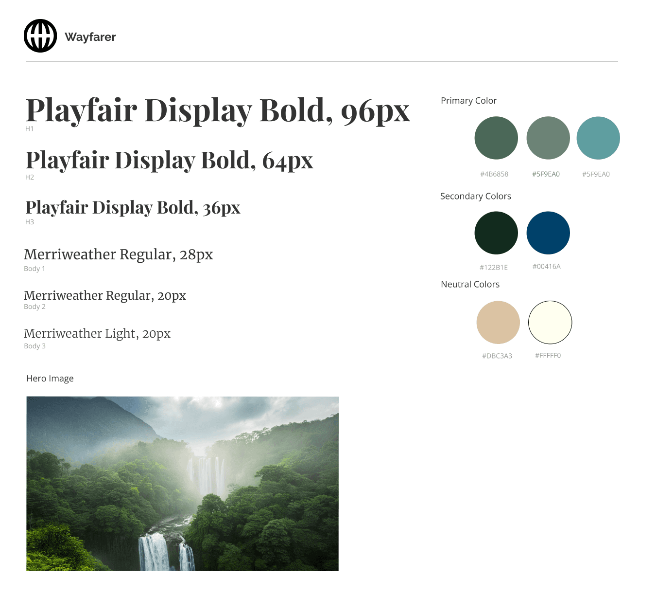
Wayfarer UI Style Kit
Design Process
Becoming familiar with principles
In the initial stages of this project, we were asked to sketch and create lo-fi wireframes of the Wayfarer site homepage. Through this process, I was able to become familiar with Figma, grids, generative AI, and Gestalt principles.
Process Documentation
In the pictures below you'll see my process of building out the homepage:
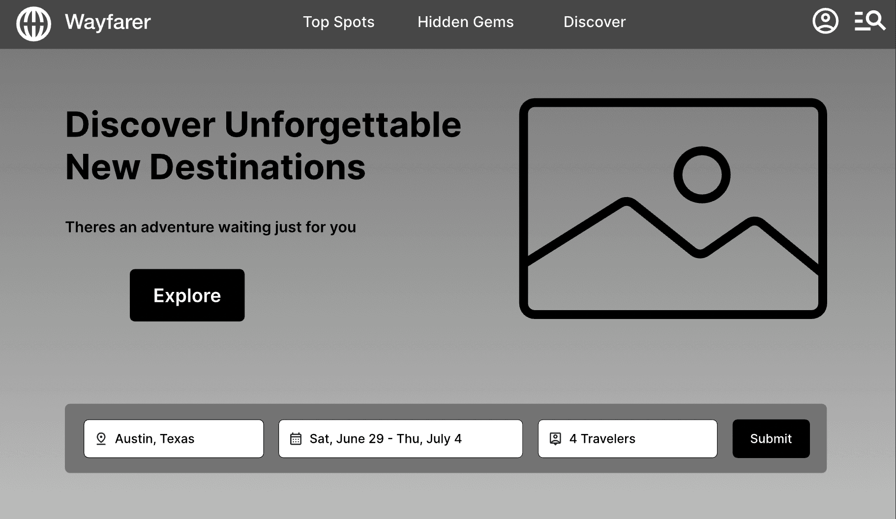
Lo-fi wireframe of homepage
Hi-fi completed wireframe of homepage
Sketches of input form user takes to customize travel experience
Hi-fi wireframes of input form user takes to customize travel experience
Wayfarer Mid-fi Hero Section Wireframe
Wayfarer Mid-fi Hero Section Wireframe


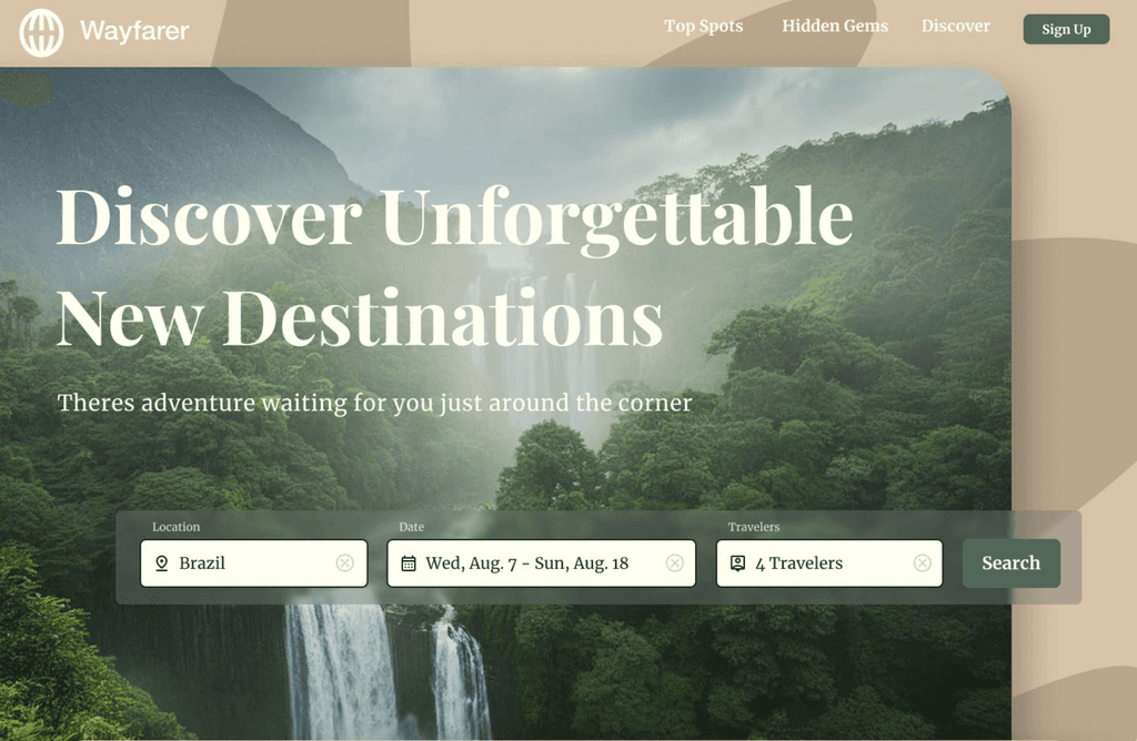
Wayfarer Desktop Hi-fi Wireframe
Wayfarer Desktop Hi-fi Wireframe
Wayfarer User Form Lo-fi Wireframe
Wayfarer User Form Lo-fi Wireframe
Wayfarer UI Style Kit
Wayfarer UI Style Kit


Wayfarer User Form Hi-fi Wireframe
Wayfarer User Form Hi-fi Wireframe
Responsive Design
Designing for mobile
If a user accesses a website on their phone, the site would need to be responsive in order for them to view it effectively. That includes appropriately sized images and text, and making the most of phone-native features like location services and account information autofilling for the user.
Keeping that in mind, I adapted my Wayfarer homepage design for mobile devices:
Wayfarer Mobile Hi-fi Wireframes
Wayfarer Mobile Hi-fi Wireframes
Key Takeaways
Reflection
Wayfarer is my introduction into hands-on UI/UX design. I was able to learn so much about design essentials, particularly finding components and Gestalt principles useful.
Future Notes
Some changes I would take forward into future projects is making more use of Figma grids and layer organization. I was still getting introduced to Figma during this project, and looking back I see how staying on top of naming layers and using grids would contribute to standardization and consistency.
Project Overview
Role
UI/UX Designer
Team
Individual project mentored by Bob Ricca and Diana Martinez
Timeline
8 weeks; May 2024-July 2024
Tools Used
Figma, Adobe Firefly, Google Meets, Google Fonts
Note
My first ever UI/UX design project, with a multi-step form and breakpoints created for mobile, tablet, and desktop. Wayfarer is a design brief provided by Designlab, and us students were tasked to create an original design.
Design Process
Becoming familiar with principles
In the initial stages of this project, we were asked to sketch and create lo-fi wireframes of the Wayfarer site homepage. Through this process, I was able to become familiar with Figma, grids, generative AI, and Gestalt principles.
Process Documentation
In the pictures below you'll see my process of building out the homepage:
Lo-fi wireframe of homepage
Hi-fi completed wireframe of homepage
Sketches of input form user takes to customize travel experience
Hi-fi wireframes of input form user takes to customize travel experience
The Context
Problem
Aspiring travelers need help with travel inspiration specific to their tastes and are having trouble finding the customization they're craving.
Solution
Providing travelers with a way to input what kind of trip they're looking for so they can get the results they care most about.
What is Wayfarer?
Enter Wayfarer, a website that helps you book travel and activities with recommendations based off precisely what you're looking for. Customize your travel experience by finding a destination specific to your needs, complete with excursions and options for local experiences. You can search by the most popular destinations, or take a quiz to get answers completely unique to your traveling party.
Project Goal
We want to design an intuitive way for travelers to find their next travel destination. While I want to create a beautiful design, my priority is to create a site that is functional and easy to navigate using common design patterns like components and information architecture.
Responsive Design
Designing for mobile
If a user accesses a website on their phone, the site would need to be responsive in order for them to view it effectively. That includes appropriately sized images and text, and making the most of phone-native features like location services and account information autofilling for the user.
Keeping that in mind, I adapted the Wayfarer homepage design for mobile devices:
Key Takeaways
Reflection
Wayfarer is my introduction into hands-on UI/UX design. I was able to learn so much about design essentials, particularly finding components and Gestalt principles useful.
Future Notes
Some changes I would take forward into future projects is making more use of Figma grids and layer organization. I was still getting introduced to Figma during this project, and looking back I see how staying on top of naming layers and using grids would contribute to standardization and consistency.
Project Overview
Role
UI/UX Designer
Team
Individual project mentored by Bob Ricca and Diana Martinez
Timeline
8 weeks; May 2024-July 2024
Tools Used
Figma, Adobe Firefly, Google Meets, Google Fonts
Note
My first ever UI/UX design project, with a multi-step form and breakpoints created for mobile, tablet, and desktop. Wayfarer is a design brief provided by Designlab, and us students were tasked to create an original design.
The Context
Problem
Aspiring travelers need help with travel inspiration specific to their tastes and are having trouble finding the customization they're craving.
Solution
Providing travelers with a way to input what kind of trip they're looking for so they can get the results they care most about.
What is Wayfarer?
Enter Wayfarer, a website that helps you book travel and activities with recommendations based off precisely what you're looking for. Customize your travel experience by finding a destination specific to your needs, complete with excursions and options for local experiences. You can search by the most popular destinations, or take a quiz to get answers completely unique to your traveling party.
Project Goal
We want to design an intuitive way for travelers to find their next travel destination. While I want to create a beautiful design, my priority is to create a site that is functional and easy to navigate using common design patterns like components and information architecture.
The User
User Interviews
I interviewed 6 people who expressed interest in expanding their social life. We gathered their priorities and found areas where we could address common needs.
User Interview Results
Interest in hobbies
Challenges in forming new relationships
Desire for more social time
Openness to meeting new people
Use of technology for social connections
Potential for a platform to facilitate connections
Group vs one-on-one settings
Responsive Design
Designing for mobile
If a user accesses a website on their phone, the site would need to be responsive in order for them to view it effectively. That includes appropriately sized images and text, and making the most of phone-native features like location services and account information autofilling for the user.
Keeping that in mind, I adapted the Wayfarer homepage design for mobile devices:
Key Takeaways
Reflection
Wayfarer is my introduction into hands-on UI/UX design. I was able to learn so much about design essentials, particularly finding components and Gestalt principles useful.
Future Notes
Some changes I would take forward into future projects is making more use of Figma grids and layer organization. I was still getting introduced to Figma during this project, and looking back I see how staying on top of naming layers and using grids would contribute to standardization and consistency.


Design Process
Becoming familiar with principles
In the initial stages of this project, we were asked to sketch and create lo-fi wireframes of the Wayfarer site homepage. Through this process, I was able to become familiar with Figma, grids, generative AI, and Gestalt principles.
Process Documentation
In the pictures below you'll see my process of building out the homepage:
Lo-fi wireframe of homepage
Hi-fi completed wireframe of homepage
Sketches of input form user takes to customize travel experience
Hi-fi wireframes of input form user takes to customize travel experience
The User
User Interviews
I interviewed 6 people who expressed interest in expanding their social life. We gathered their priorities and found areas where we could address common needs.
User Interview Results
Interest in hobbies
Challenges in forming new relationships
Desire for more social time
Openness to meeting new people
Use of technology for social connections
Potential for a platform to facilitate connections
Group vs one-on-one settings


